Wireframes.
just a small taste…
website & admin panel | real estate
Project overview
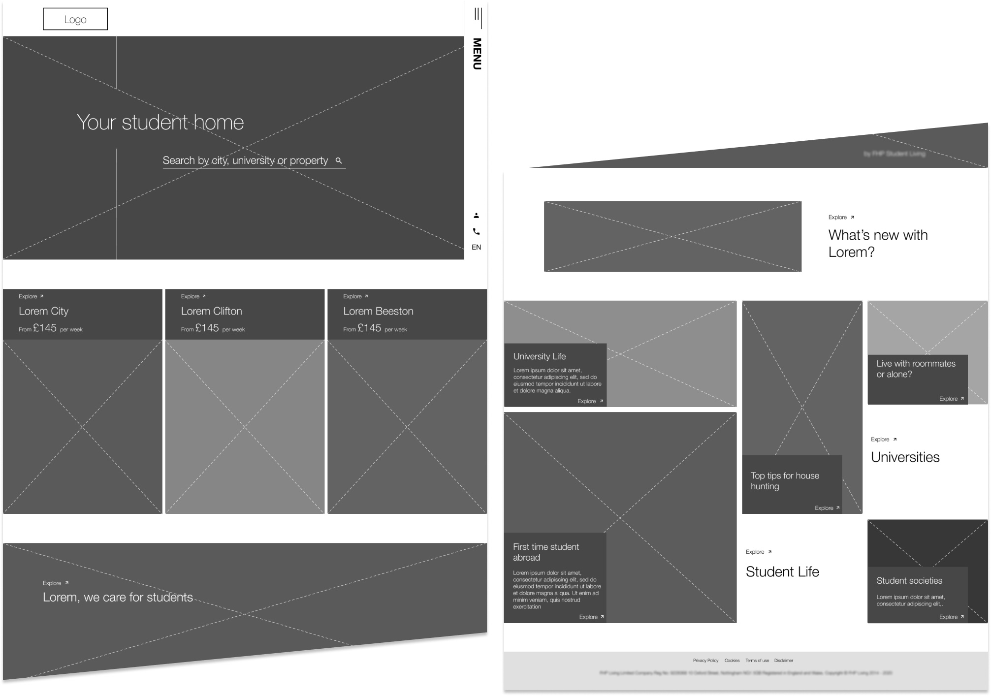
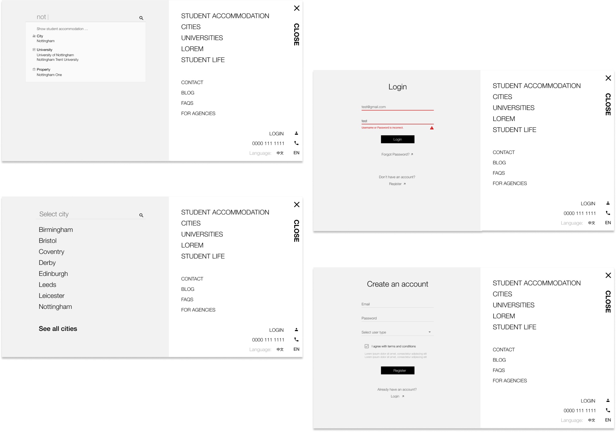
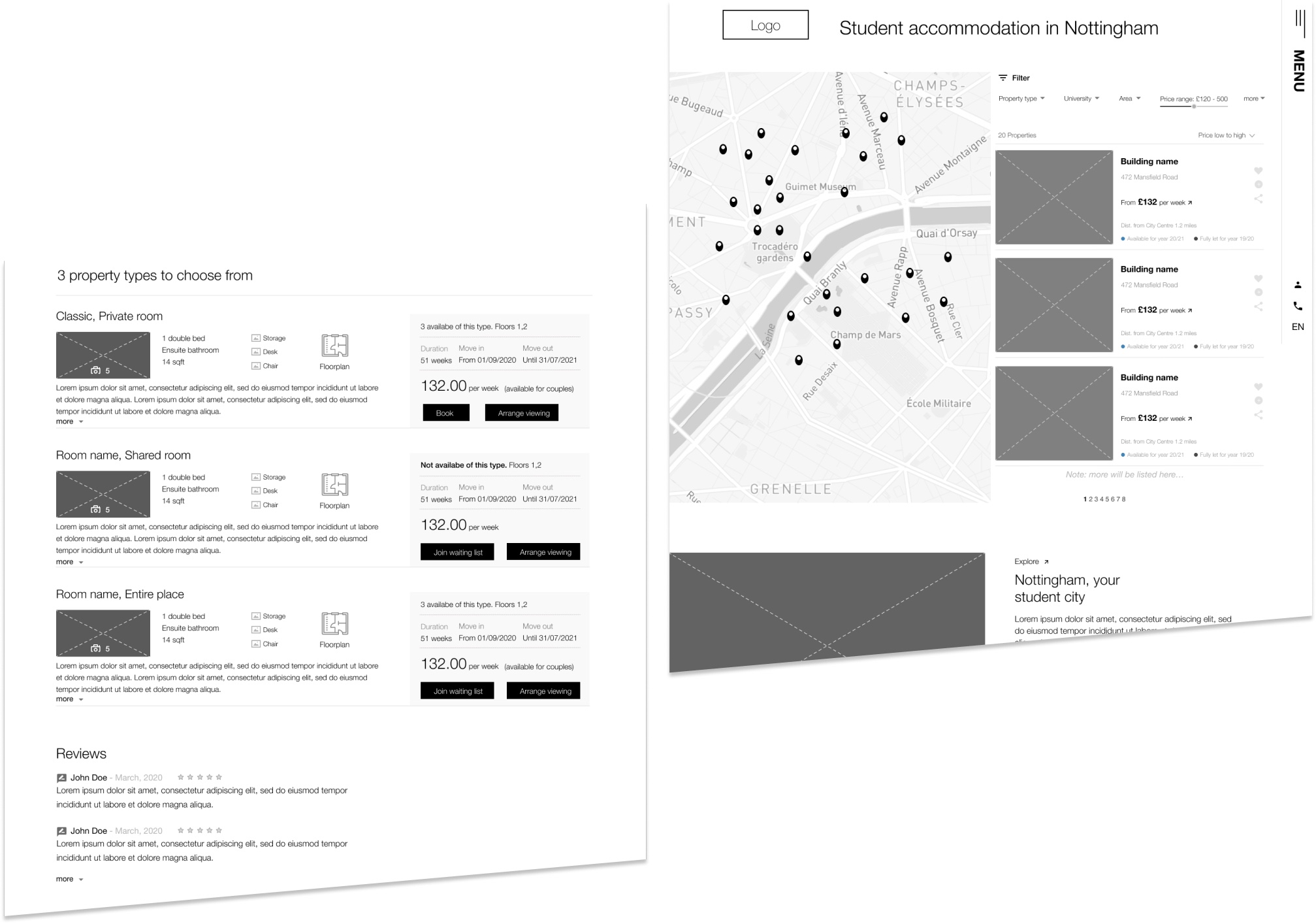
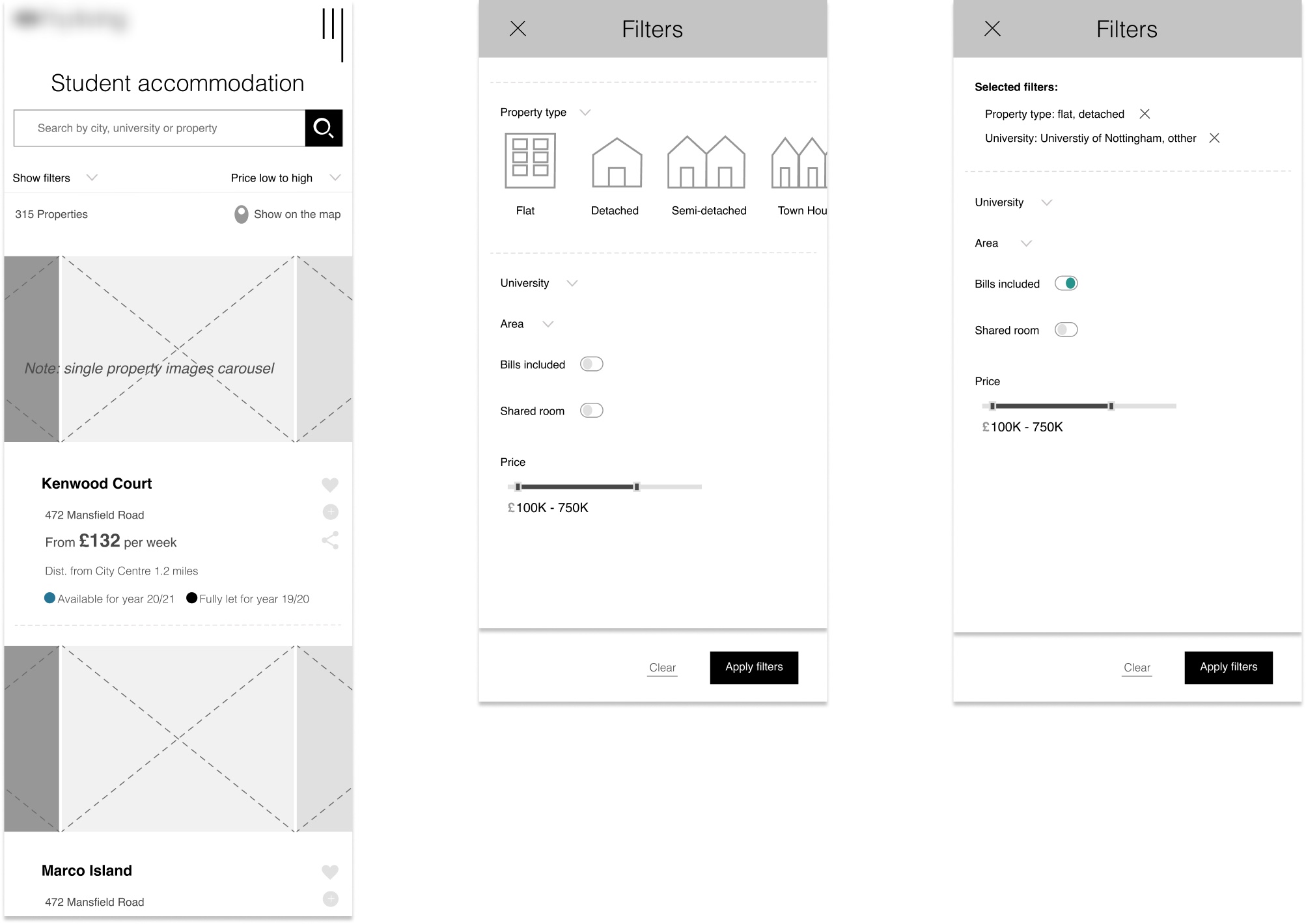
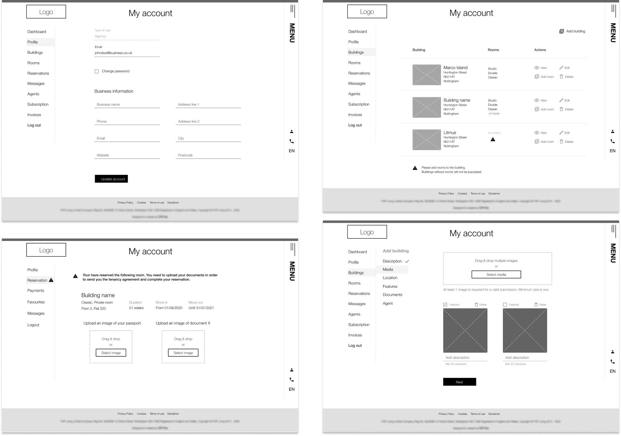
A full set of detailed wireframes for desktop and mobile was produced for a student’s accommodation system. The project had all the characteristics of a real estate agency interface but users profile required a slightly different approach in design.
Approach
After thorough investigation we concluded that there are two main areas for someone who is looking for student accommodation: housing and student life. Throughout the website there are clear entry points for both directions.
The upper goal was to develop a platform for two core users: students and agents/property owners.
Project overview
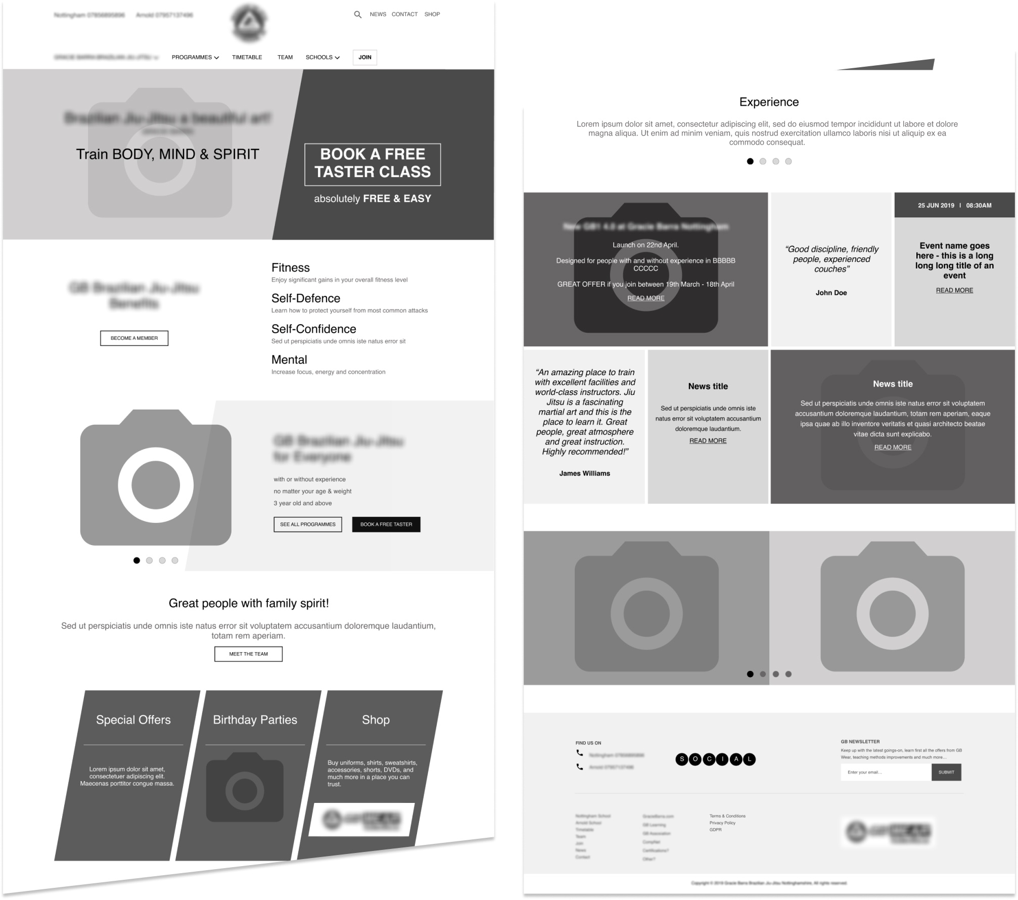
This is a sample homepage wireframe for a fitness and sports website. The website’s scope is prominent on the homepage, that is to attract new members and promote the benefits of joining the team.
A long page, with big images, large text and call to actions (CTAs), displays clear entry points to the core user journey. Similar approach was used for the rest of the website pages.
website | fitness & sports
Project overview
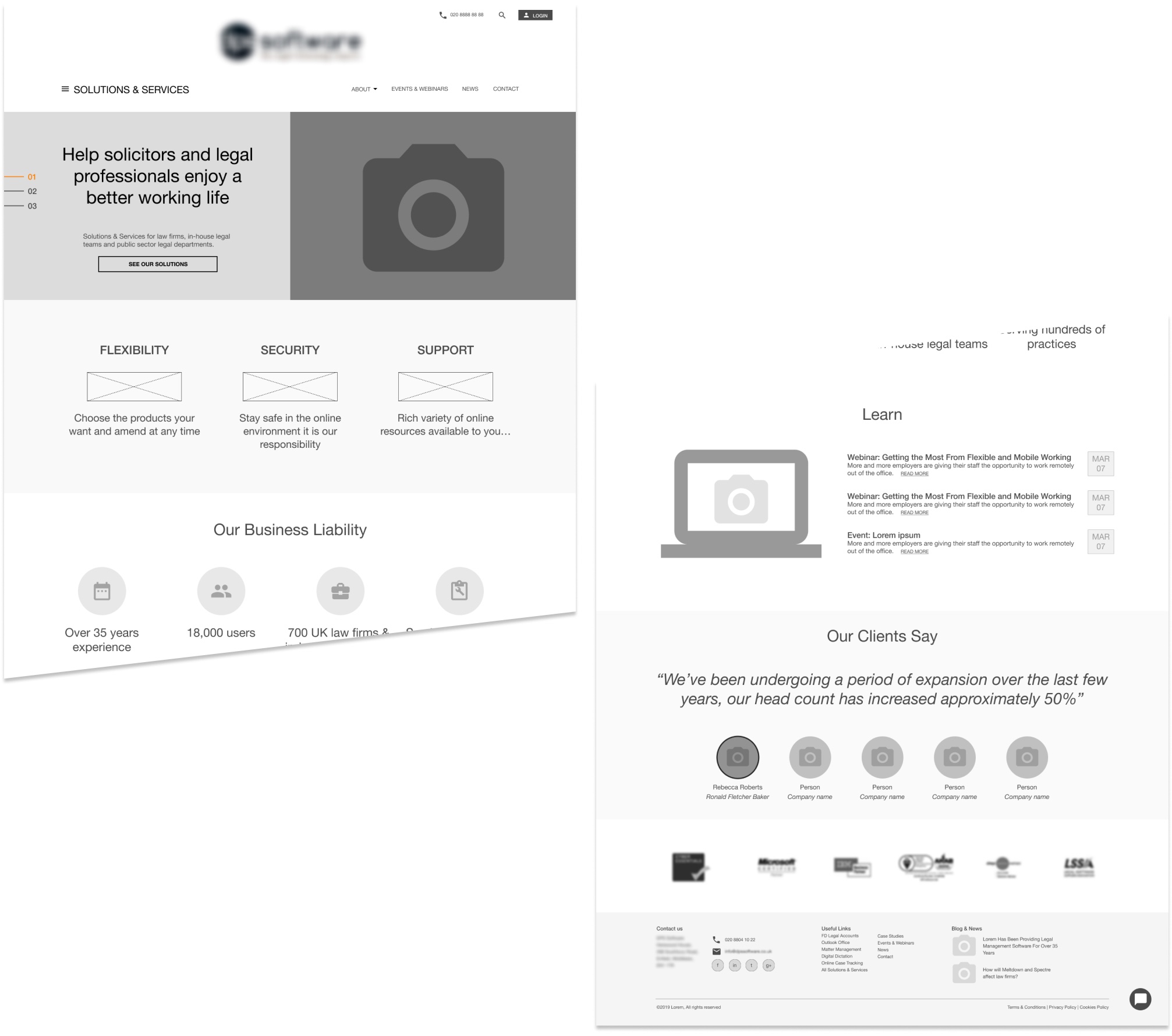
A legal software company was looking to improve their website user experience. The basic weakness of the old website was service findability.
The solution was to use a full page mega menu dedicated to solutions & services, along with a refined content grouping. Also, there was an effort to boost business liability by presenting company trust policies, fingers, partners and testimonials on the homepage.
